

37.7749° N, 122.4194° W
Big Tea
Branding
/
Design
/
(
©2025
)
Scroll Down
Overview
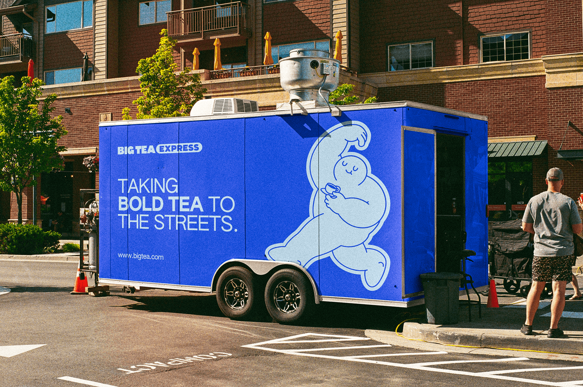
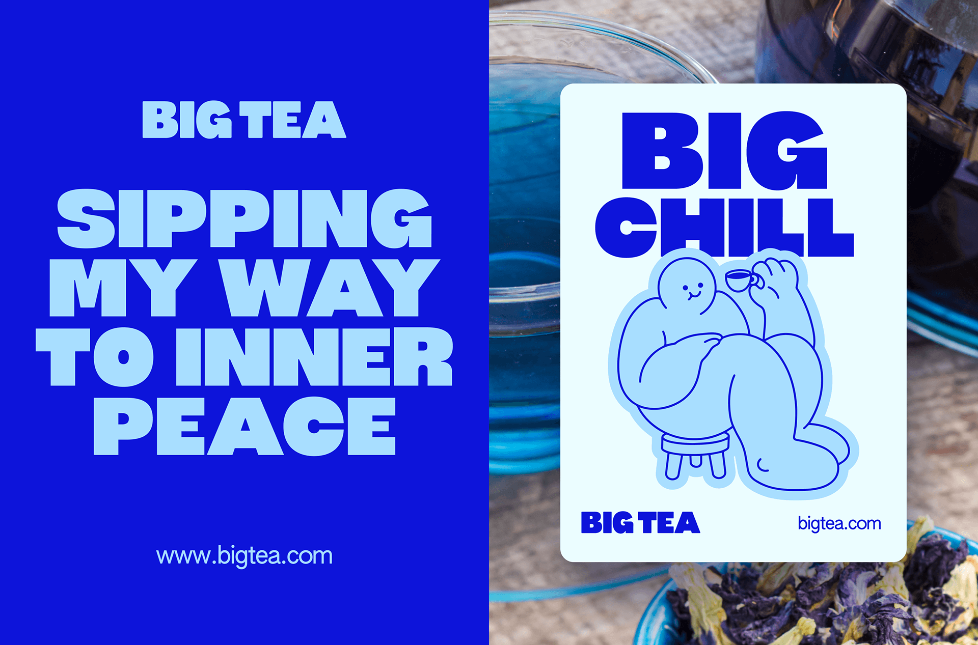
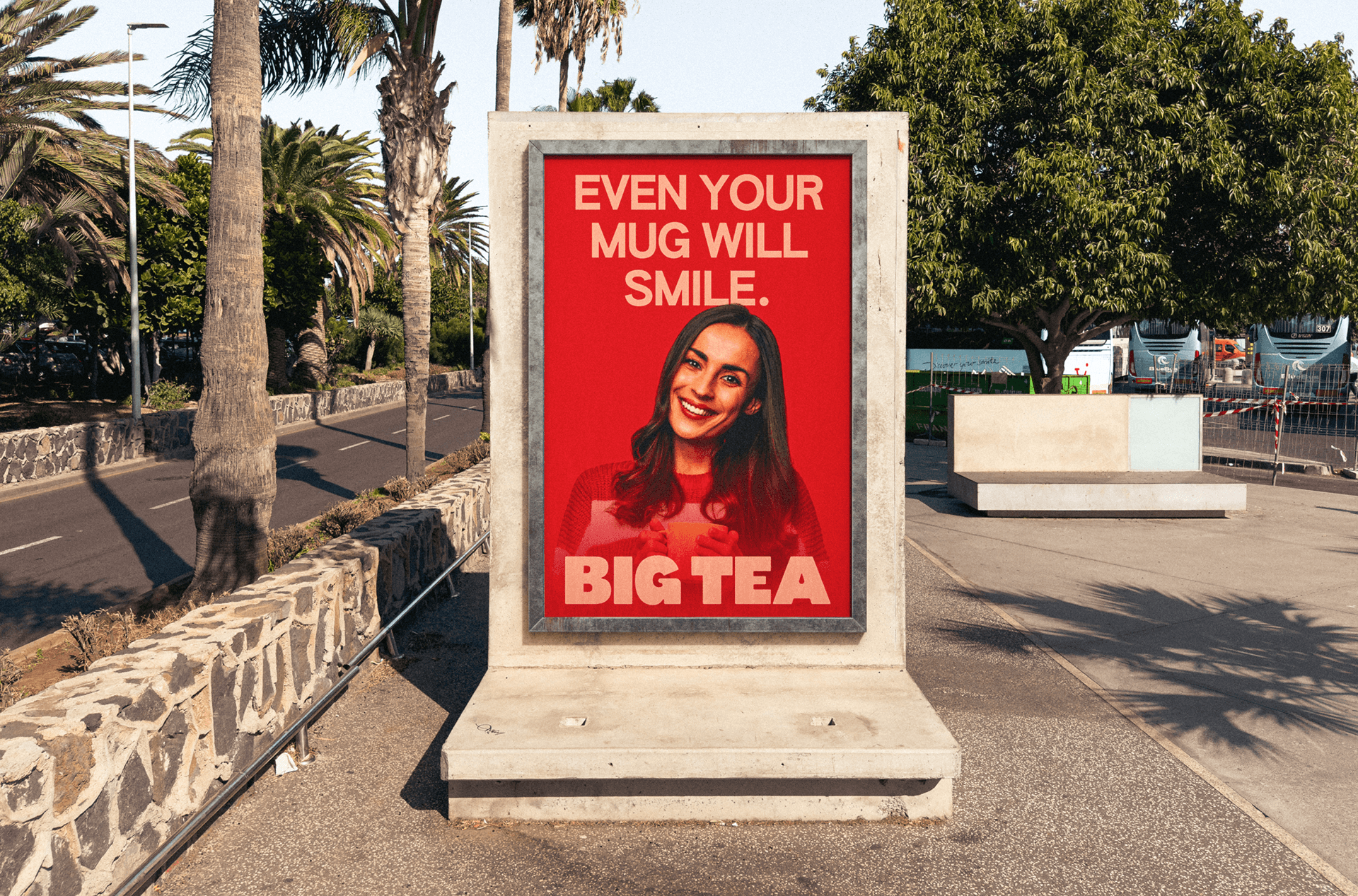
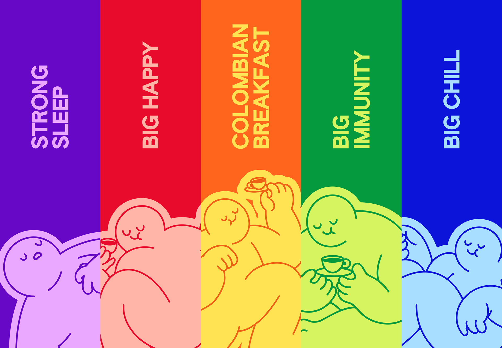
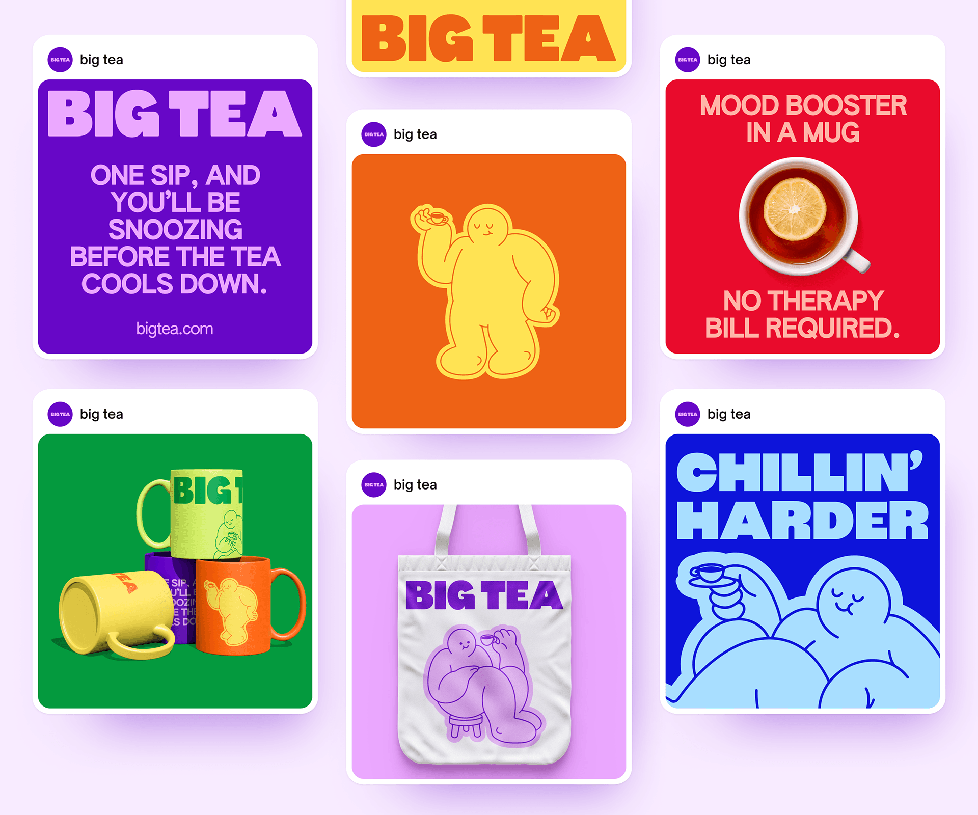
Big Tea came to us frustrated with how tea is typically presented. The category felt overly muted and generic, leaving little room for personality or clarity. At the same time, the brand had a strong point of view and a clear idea of how it wanted to show up.
Our role was to translate those frustrations into a cohesive visual direction. We focused on creating a system that allowed for bold expression while remaining structured and intentional, using color, illustration, and typography to support the brand’s energy.
Approaching the project from a contemporary perspective rather than traditional tea conventions, we built a flexible identity that reflects the brand’s voice and can be applied consistently across different spaces.
Year
©2025
Client
Big Tea
Services
Branding
/
Design
/


No items found.
vision
Studio
