

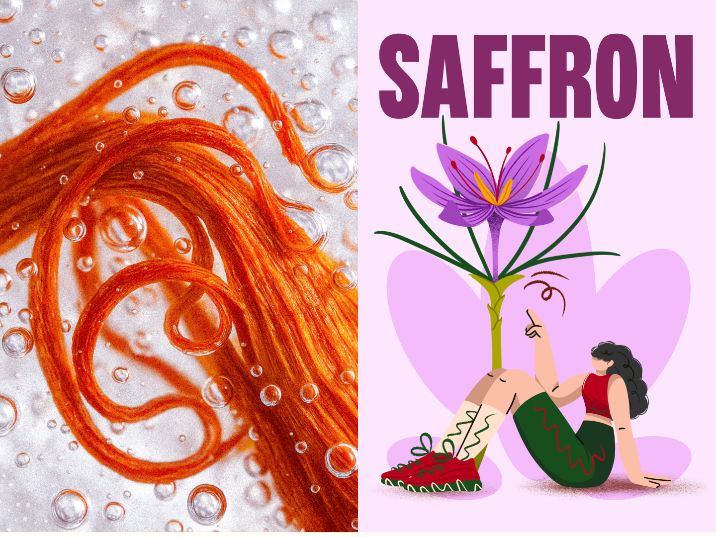
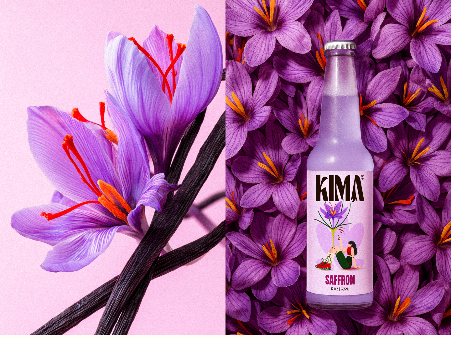
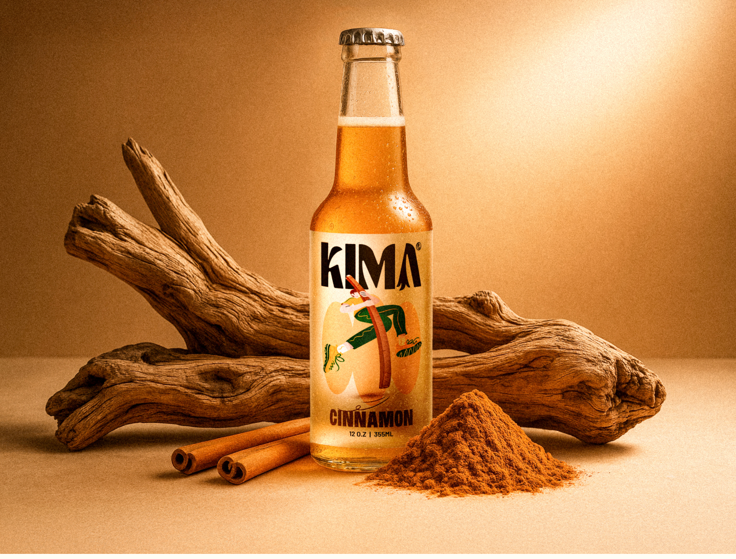
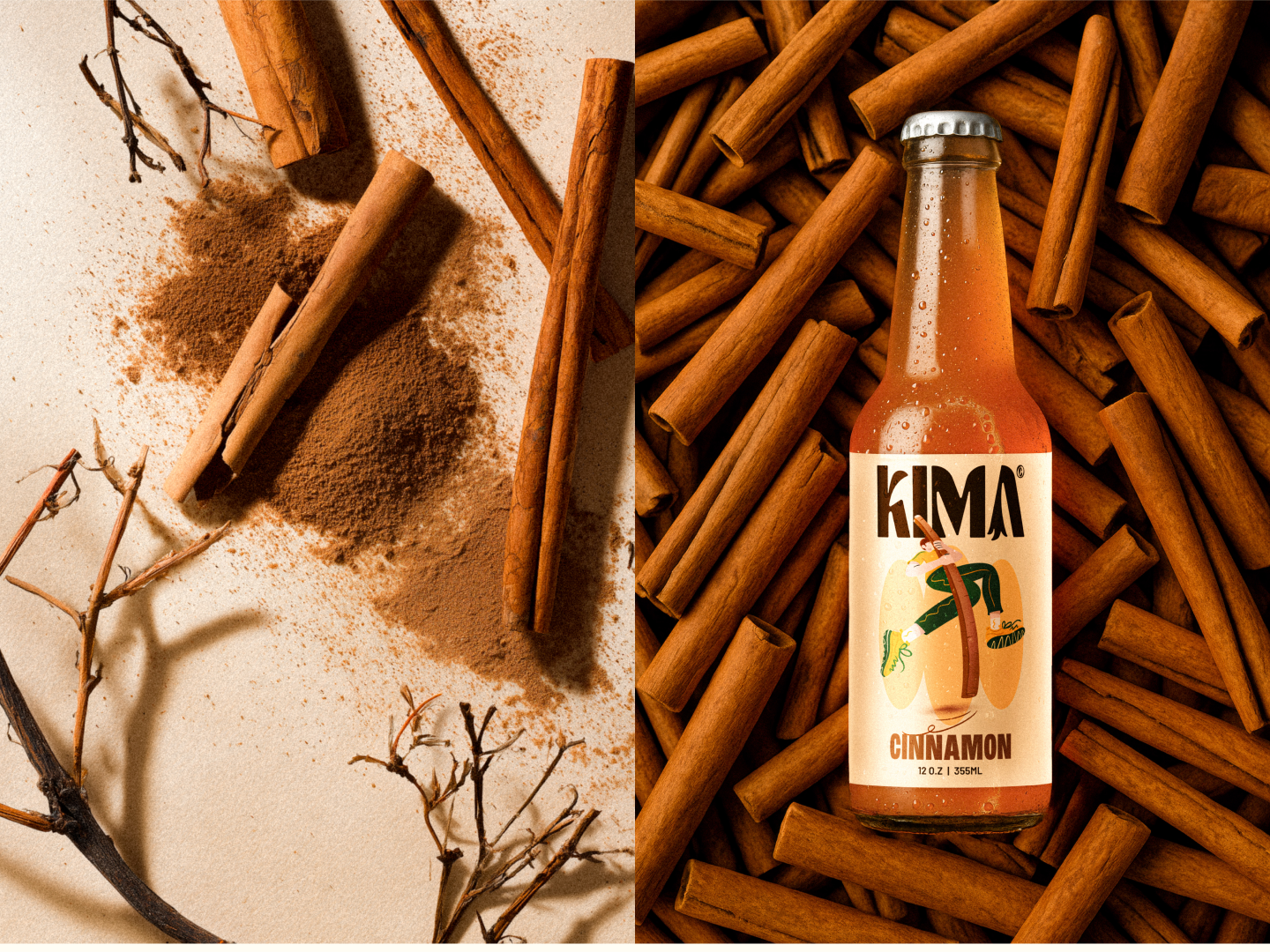
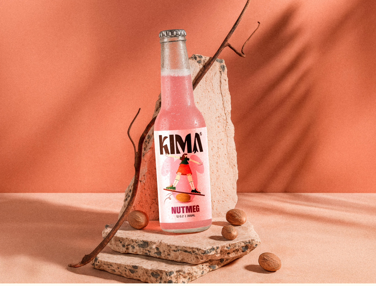
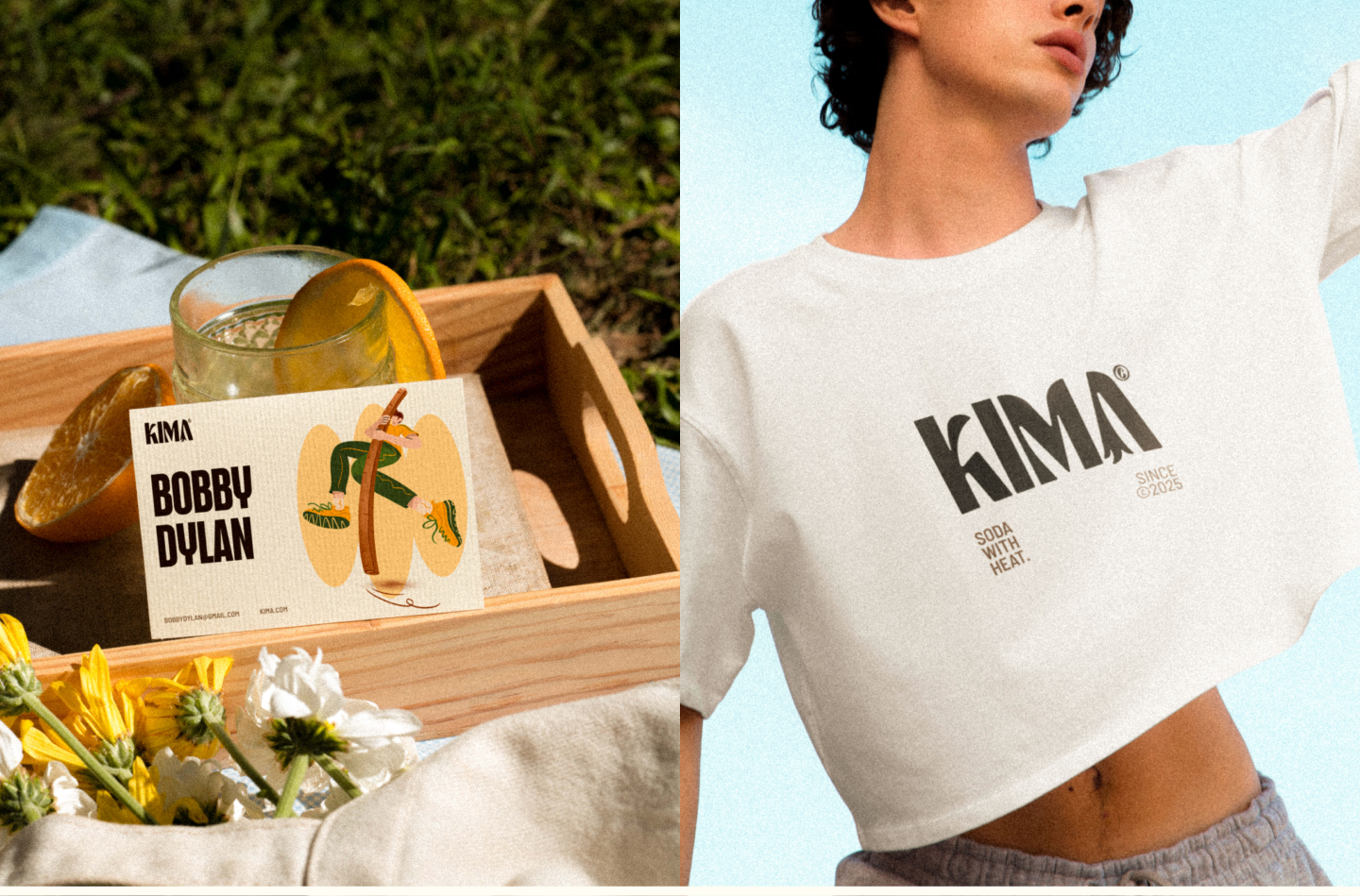
Kima
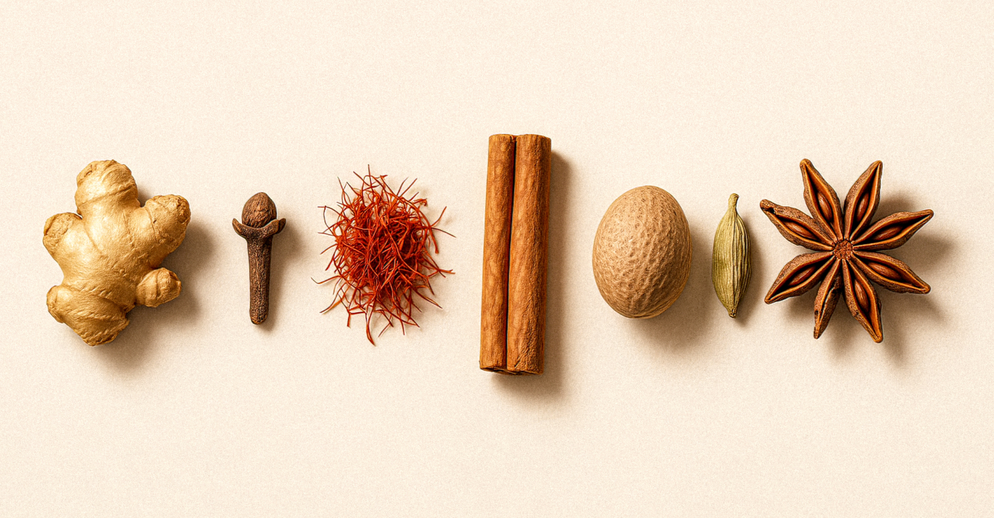
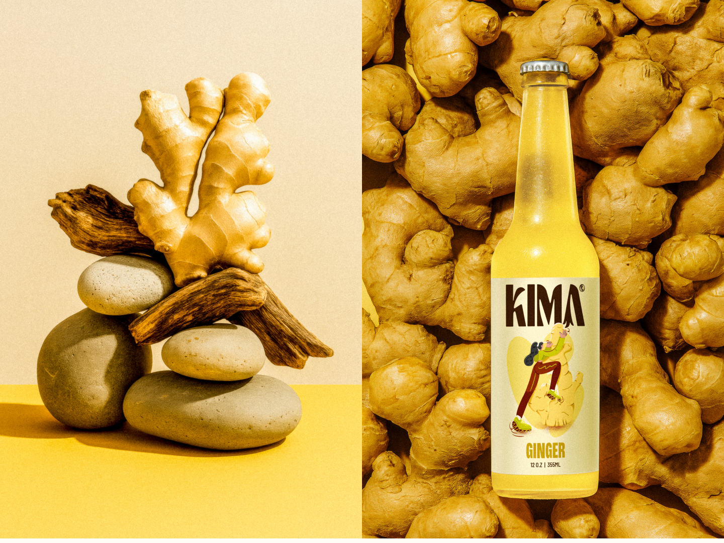
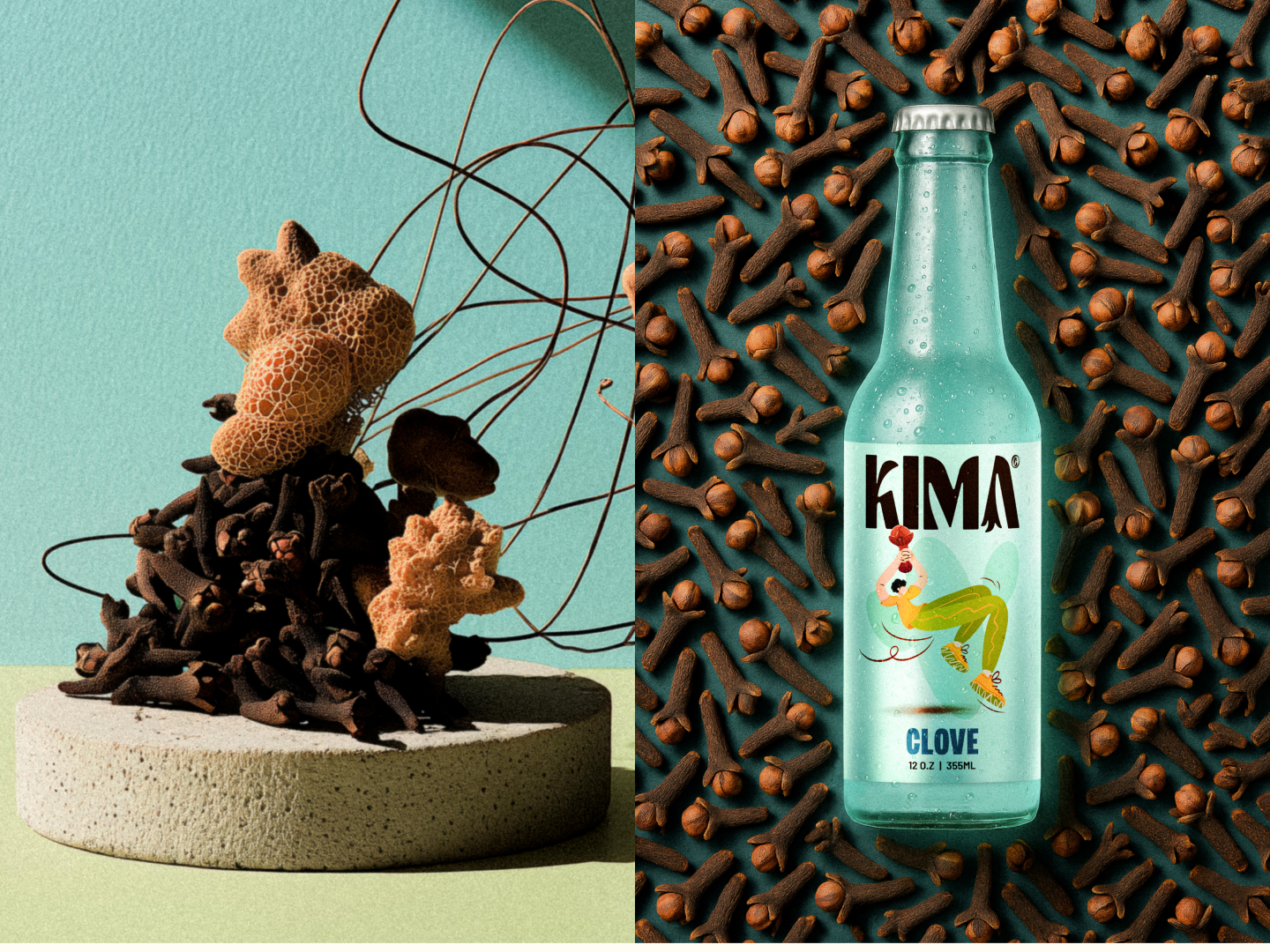
KIMA approaches soda through a spiced, minimalist lens, focusing on heat, warmth, and aromatic depth rather than sweetness. The brand’s language centers spices as the main character, emphasizing clarity, restraint, and a more grown-up take on flavor.
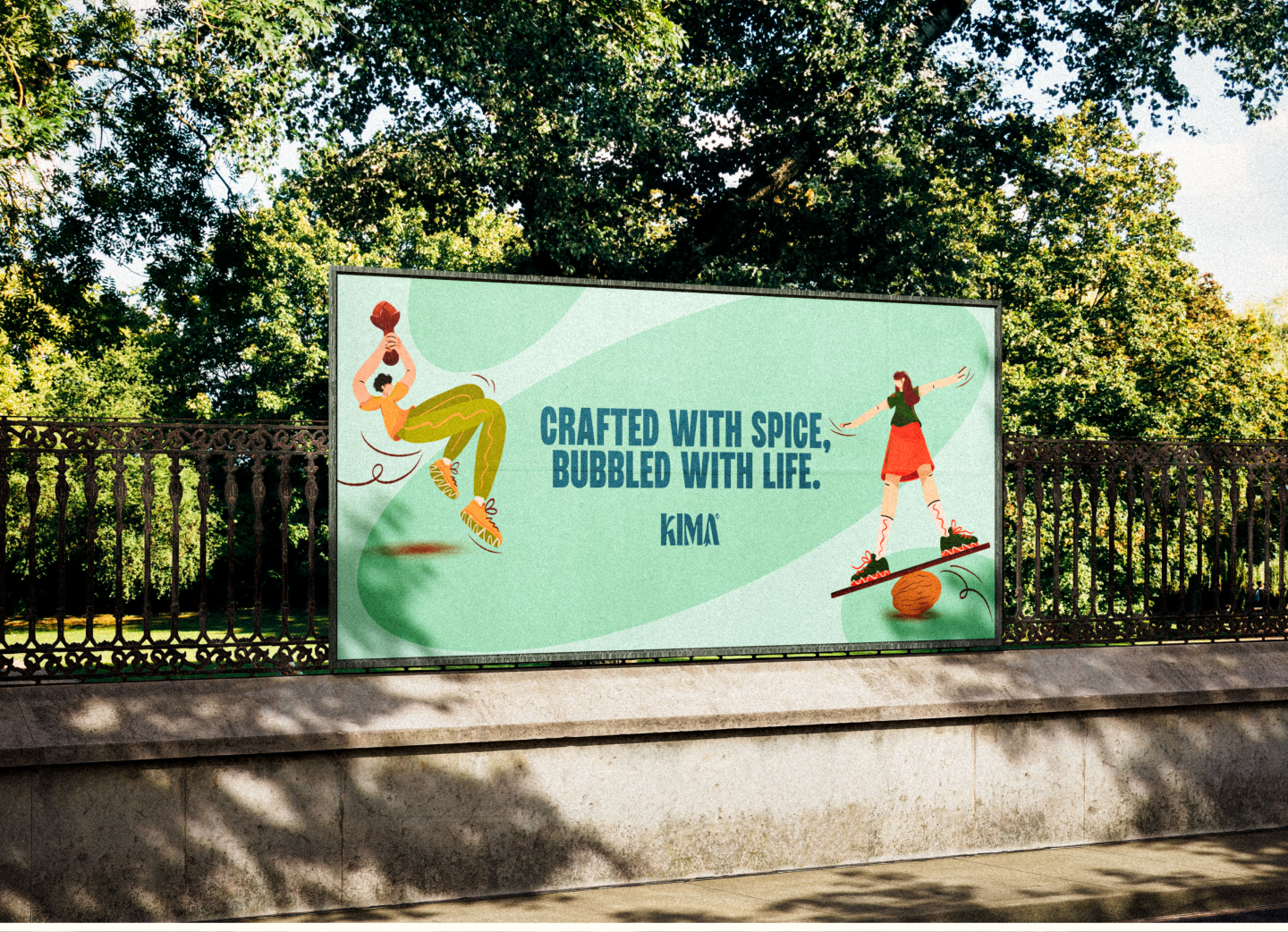
Our work focused on translating that philosophy into a clean visual system supported by illustration. We developed characters and compositions that reflect the personality of each spice, using minimal line work, soft movement, and warm, grounded tones to keep the system expressive without feeling loud.
The resulting direction supports KIMA’s emphasis on simplicity and intensity, creating a visual language that feels calm, intentional, and closely tied to the ingredients at the core of the brand.

vision
Studio
