

37.7749° N, 122.4194° W
Mama Chow
Design
/
Branding
/
(
©2022
)
Scroll Down
Overview
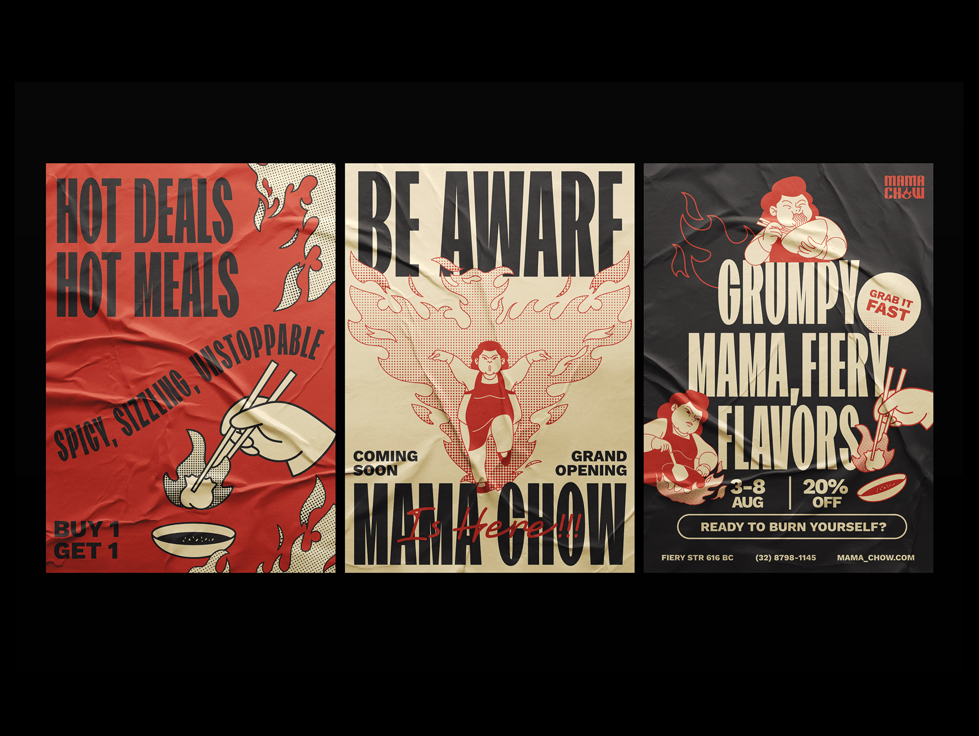
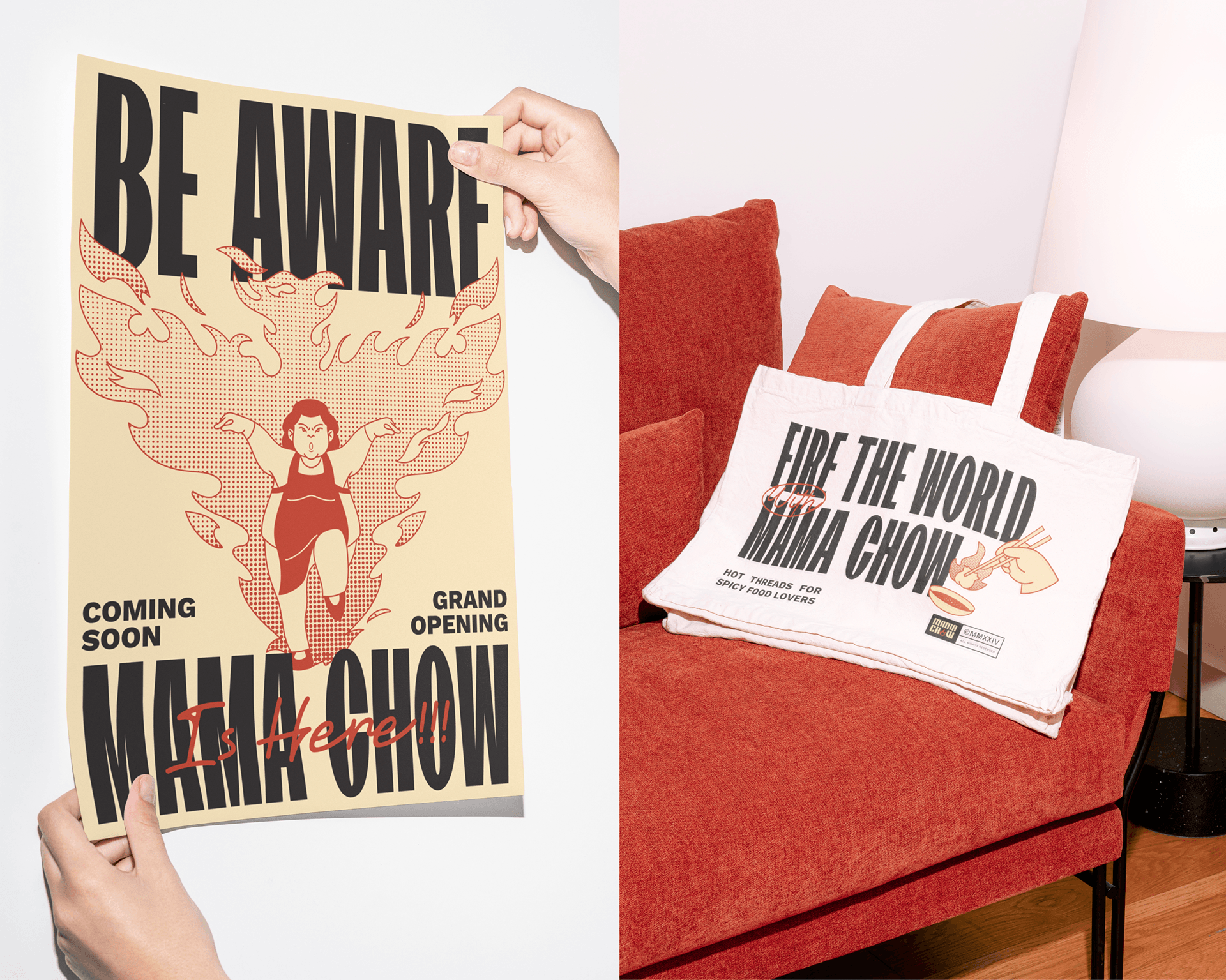
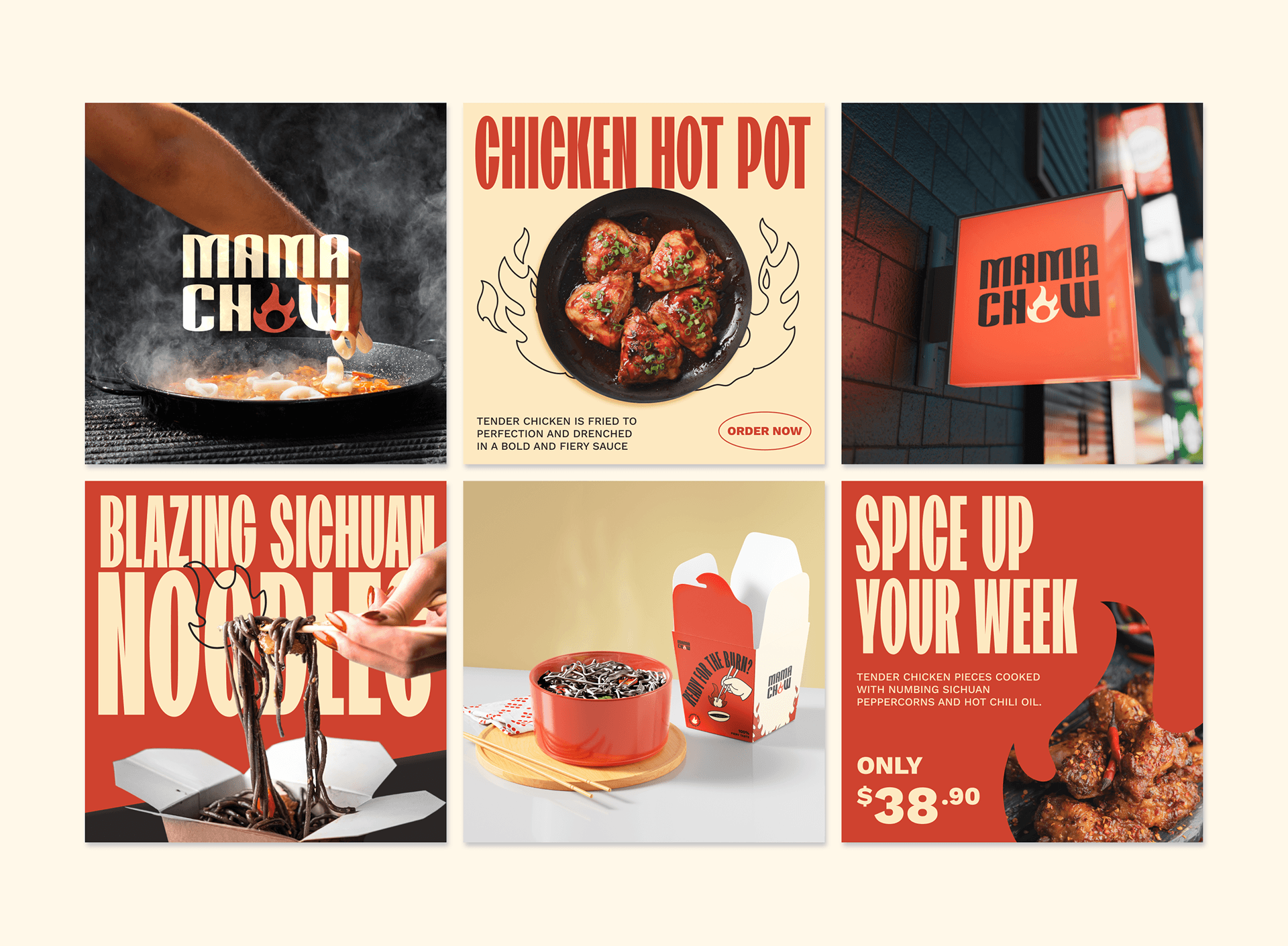
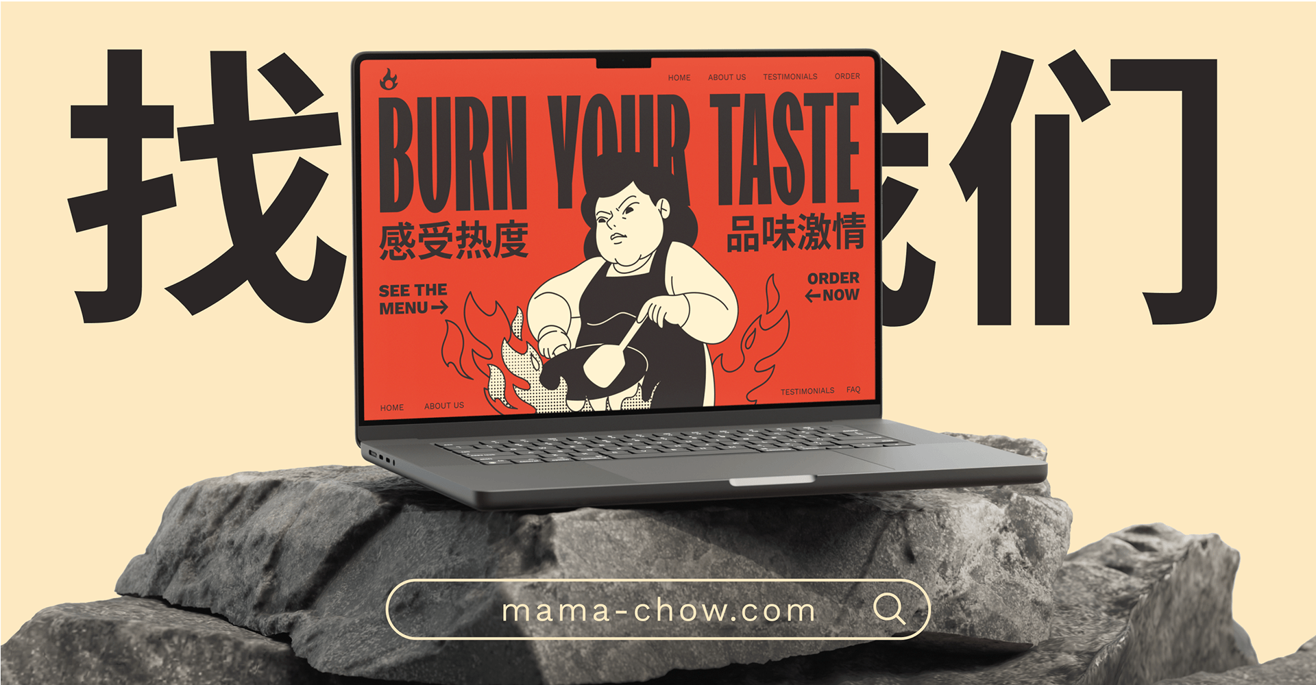
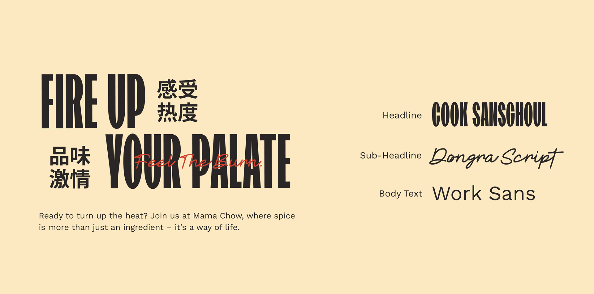
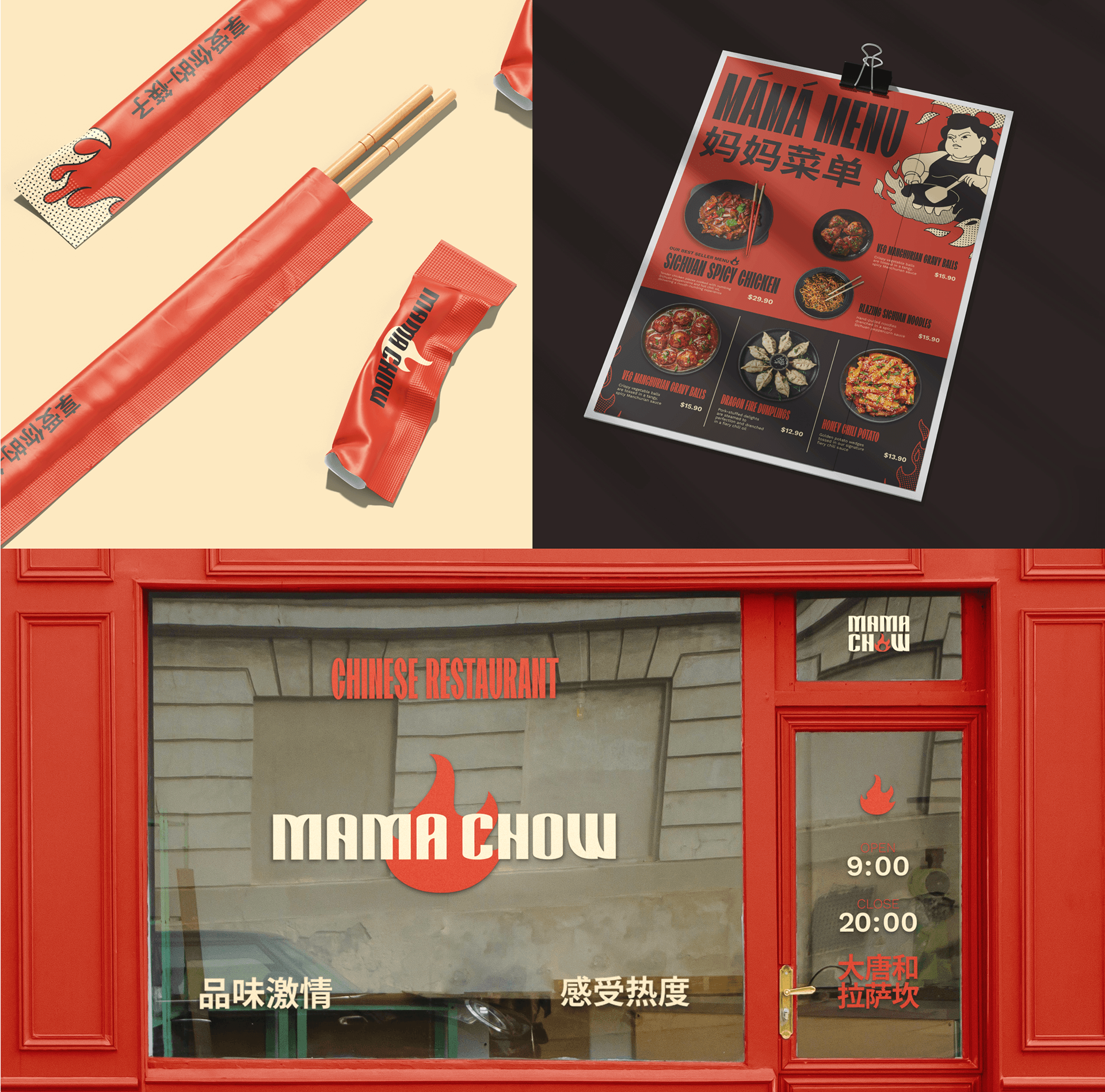
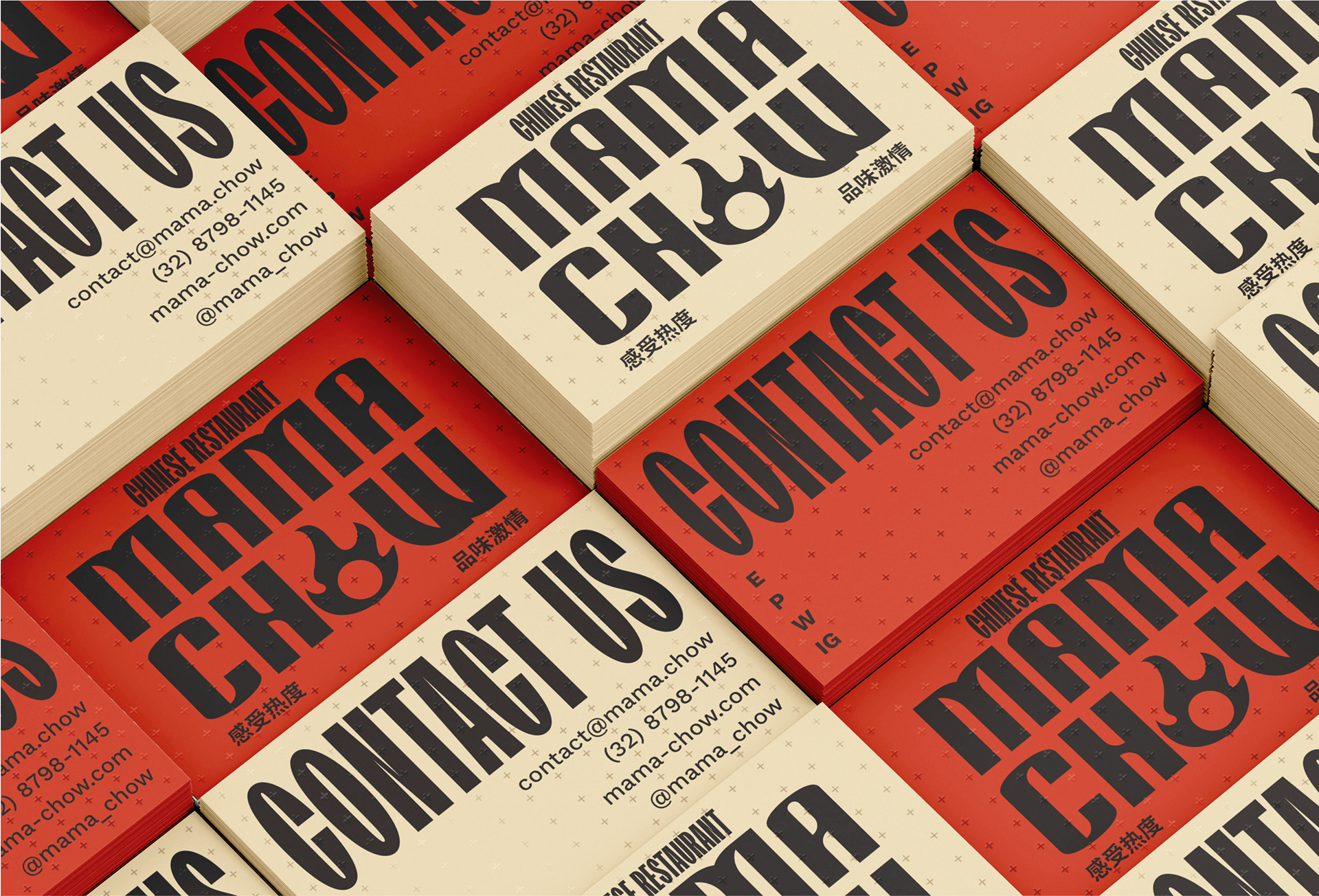
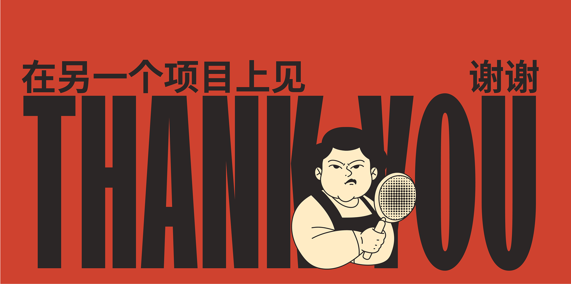
Mama Chow pulls from Chinese culinary traditions and pairs them with a bold, character-driven tone centered around spice and personality. The brand embraces intensity in a playful way, using heat, humor, and strong visual cues as core elements of its identity.
Our role was to translate that energy into a graphic system that felt loud, expressive, and approachable. We focused on punchy typography, illustrated characters, and high-contrast color to support the brand’s voice while keeping layouts clear and flexible.
The resulting direction reflects Mama Chow’s spirited attitude and poster-style aesthetic, creating a cohesive visual language that carries across promotions, print, and digital touchpoints.
Year
©2022
Client
Medium Scene
Services
Design
/
Branding
/

No items found.

vision
Studio
